Inky wHat - Dashboard
I am quite a Raspberry Pi and Pimoroni fan and was given an inky wHat for Christmas. The inky wHat (and pHat) are E-ink / ePaper displays similar to the Kindle screens which are easy to read in bright sunlight, they also use very little energy and so are a great candidate for a mini-dashboard powered by a Pi.
Its important to note that the inky wHat will only display 3 colours, red, white or black so this isn’t an appropriate choice if you want a full RGB dashboard. The Pimoroni samples include examples of converting a full colour image to black, white and red which can be displayed.
In this post I will show you how I built a dashboard that allows my wife and I to get an overview of:
- Our phone’s and 4g router’s data usage
- Weather
- Calendar events
Existing setup
I have a couple of Pi powered projects currently in place at home, such as an ELK stack (I have another application which gets my 4g data usage and stores it in ElasticSearch), and some Pi Motes connected to the Dark Sky API. ElasticSearch, the Dark Sky API and my calendar provide the data sources for my dashboard.
Inky wHat
Interfacing with the Inky wHat is possible via the python library that Pimoroni provide. Specifically the library must be passed an image and when the show method is called the library sends the appropriate instructions to the e-ink screen resulting in the image being displayed.
The plan
- Design the dashboard layout
- Create a template to be used as the “dashboard background”
- Write “Microservices” (#buzzwordbingo) to output an image per data source
- Layer up the final image (dashboard background + images per data source)
- Push image to display
Designing the dashboard
I have a copy of Affinity Designer and used that to mock up my dashboard. I hit a couple of stumbling blocks when using Designer, because the display has a resolution of 400x400 and I wanted to avoid any aliasing issues there are a couple of extra options you need to enable / tinker with. Specifically:
![]() Affinity designer pixel options enabling pixel snapping
Affinity designer pixel options enabling pixel snapping
This ensures that you don’t end up with blurred edges on the dashboard frame.If you are still struggling to get things pixel perfect check out this forum post for assigning a custom Layer blend coverage map which might help solve any aliasing issues.
I also needed a suitable pixel font such as VCR OSD MONO. To ensure that the font remains sharp you need to use a font size that is a multiple of 21.
The dashboard template:
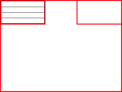 Data usage in top left, weather & temperature in the top right and a center section for calendar events
Code
I wanted to continue learning Go so I decided to use that and the Go Graphics library to build the images and then pass those images onto the python library. For a quick example, here is the code I used to build the calendar text:
package main

import (
	"fmt"
	"os"
	"os/exec"
	"path"
	"strings"

	gg "github.com/fogleman/gg"
)

func handleError(err error) {
	if err != nil {
		fmt.Printf("%+v\n", err)
		panic(err)
	}
}

func main() {
	fontPath := os.Args[1]
	outputDir := os.Args[2]

	out, err := exec.Command("sh", "-c", "~/isc_parser/target/release/isc_parser").Output() // this is a tool I wrote in Rust, I write a post about this later.
	if err != nil {
		fmt.Println("error occurred")
		fmt.Printf("%s", err)
	}
	var output = strings.TrimSpace(string(out))
	simImage := gg.NewContext(400, 400)
	if len(output) > 5 { // poor/lazy mans check to see if we actually have a calendar event to display.
		simImage.SetRGB255(0, 0, 0)
		if err := simImage.LoadFontFace(fontPath, 63); err != nil {
			panic(err)
		}
		simImage.DrawStringWrapped(output, 200, 200, 0.5, 0.5, 394, 1, gg.AlignCenter)
	}
	simImage.SavePNG(path.Join(outputDir + "calendar.png"))
The Pimoroni example script is capable of converting colours and resizing images so that it fits into the 400x400 display. However we are generating the images from scratch we can avoid those steps completely.
Execution
The microservices don’t need to be running all the time so I decided to run them regularly using the CRON scheduler on the Pi. If you haven’t seen it before the crontab guru is a fantastic tool for building CRON expressions. To make sure that the display has the latest images from the microservices I run them the minute before the display will update which is plenty of time for them to build their respective images.
Result
With all of those steps complete here is the final outcome:
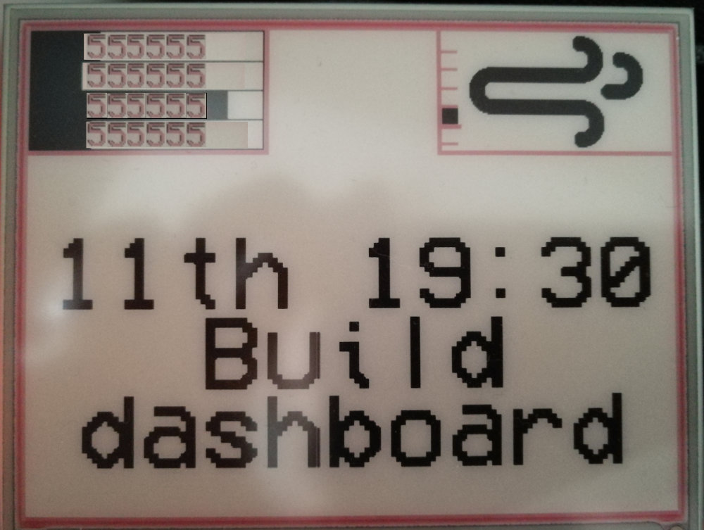 Taken with my phone camera (Phone number section obscured)
I am pleased with the outcome for the most part however, some problems arise when calendar entries have emoji in (🐈) as they are not supported, very long calendar entry titles will be cut off / cover up other parts of the display. For my purposes I am happy with this and didn’t want to spend any more time fixing those minor issues.
If you have any suggestions for what I could put in the top center of the dashboard please let me know in the comments below.